
During our visit to Manchester we visited different stores that stock New Balance such as Size? and schuh. When entering these stores it was hard to gage where abouts New Balance was situated as their visual merchandising did not stand out at all; and in some cases was squashed into the corner of the store, hardly visible. Each store did not stock a large number of New Balance, with around four being the average, and the styles that they did have were old fashioned and would not necessarily appeal to a younger market. There was no sign of any bright colours, high tops or interesting styles that would attract a younger consumer and any it was obvious that any styles on display were aimed at males only. The shoes were always displayed below hip level, so were not placed within the eye-line of consumers and the only branding of the displays was a small wooden block.
Effective visual merchandising is important in stores that stock many brands because you have to make sure you stand out against competitors as you are situated within the same space as them. New Balance can not continue to fade into the background and let their competitors take all the lime-light in the stores.
To help with this problem, I have looked into trainer visual merchandising that I witnessed in Berlin (as well as the Adidas virtual wall I have previously posted on this blog http://hannahnewbalanceblog.blogspot.com/2011/02/adidas-x-intel-off-wall-idea.html) to see how other brands create effective visual merchandising and engage their consumers.
BRITISH KNIGHTS
BK simply lay their shoes out in simple, but effective rows. This keeps their displays neat while allowing consumers to easily see the whole of each trainer.


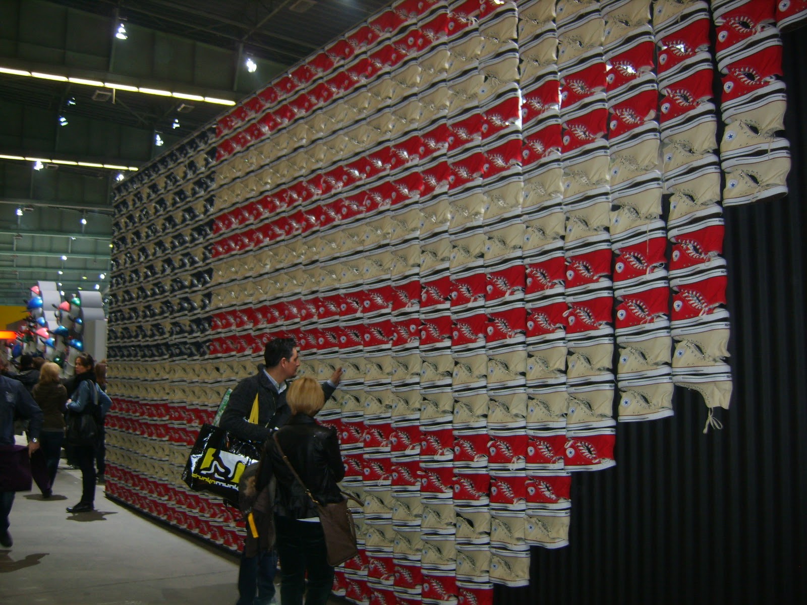
CONVERSE
This American flag made out of red, white and blue converse trainers found at the Bread & Butter Trade Show is really interesting and shows the tone of voice, of Converse being an all American brand, really well and is signed off with 'Yours Truly, Chuck Taylor'.
Meanwhile their normal in-store displays are kept simple with good spacing between the shoes so that consumers can appreciate each design.


DOC MARTINS
Doc Martins created mood boards within their stores to hang above the shoes. These were effective because they featured images of different celebrities wearing the brand; enabling consumers to take inspiration from the celebs and learning what clothes go well with the boots.
Another interesting aspect of their in-store environment was how some of the shoes were displayed by hanging them off the wall as though on a washing line.
Another interesting aspect of their in-store environment was how some of the shoes were displayed by hanging them off the wall as though on a washing line.


NEW BALANCE - at Bread & Butter
These images show how New Balance display their shoes when given the opportunity to create their own store; their pop-up stall at the Bread & Butter Trade Show.
Here they have used the same methods as other trainer brands by keeping the displays simple with a good amount of space between each style. I think that the way they branded their stall was really effective but it is a shame that this kind of merchandising does not translate into the stores that currently stock New Balance. Obviously it is hard for New Balance as they do not have their own stores within the UK but instead stock their products in stores that also have many other competitor shoes. This means that they cannot take over a whole store with their visual merchandising, but it should be possible for them to create effective merchandising for their product area.
Here they have used the same methods as other trainer brands by keeping the displays simple with a good amount of space between each style. I think that the way they branded their stall was really effective but it is a shame that this kind of merchandising does not translate into the stores that currently stock New Balance. Obviously it is hard for New Balance as they do not have their own stores within the UK but instead stock their products in stores that also have many other competitor shoes. This means that they cannot take over a whole store with their visual merchandising, but it should be possible for them to create effective merchandising for their product area.


No comments:
Post a Comment