Showing posts with label New Balance. Show all posts

Sunday, 20 March 2011

TREND TRACKING

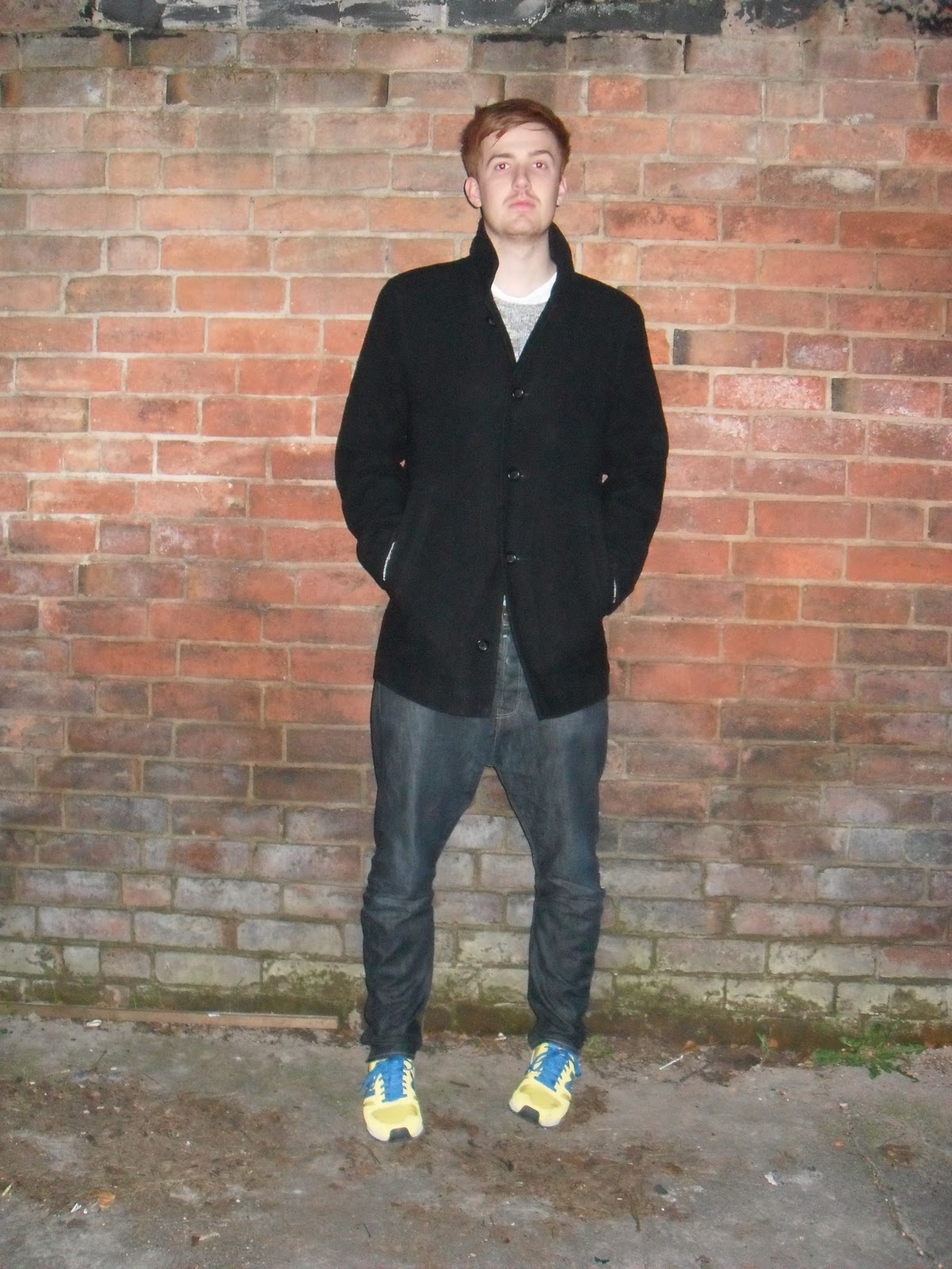
Here are a collection of images documenting the different outfits that Si wore with his New Balance trainers. These images show outfits worn every day (for University, out in the city etc) on nights out and also to the gym.
Although Si had the New Balance trainers for just under four weeks he managed to only find ten different outfits that would go with the colour of his trainers. This means that most of these outfits were used more than once throughout the trend tracking process.


Friday, 11 March 2011

NEW BALANCE COLABORATIONS - from New Balance Nutter

I have looked into some of the New Balance collaborations that the New Balance Nutter mentioned to see what the 'hype' was about...

eYe Junya Watanabe Comme des Garcons x New Balance 1500s
New Balance 1500s done up in a blue hue makeup by designer Junya Watanabe featuring suede and nylon uppers. These released exclusively in Japan at ¥31,00 (which is around $331 USD)


Staple Design x New Balance 575s - Pigeon
Released in 2008 the Pigeon trainers by Staple Design were set to be as big a hit as the Pigeon Nike Dunks in 2003. The exclusive trainers feature the pigeon stitched into the back and the pigeon poo on the sole of the shoe.


United Arrows x New Balance
The high-end Japanese retailer, United Arrow, have continuously collaborated with New Balance. The example below is their creation of the 997.5s with hints of pink and purple on the grey upper. I really like the textured sole, I think it give a unique feel and goes will with the design of the shoe.


La MJC x Colette x New Balance 1500s
Paris creative agency La MJC and Colette collaborated with New Balance to create the 'Vivre Sans Temps Mort' 1500 sneaker. The slogan used for this trainer is one of the core slogans of the agency.


Thursday, 10 March 2011

TRAINER VISUAL MERCHANDISING

During our visit to Manchester we visited different stores that stock New Balance such as Size? and schuh. When entering these stores it was hard to gage where abouts New Balance was situated as their visual merchandising did not stand out at all; and in some cases was squashed into the corner of the store, hardly visible. Each store did not stock a large number of New Balance, with around four being the average, and the styles that they did have were old fashioned and would not necessarily appeal to a younger market. There was no sign of any bright colours, high tops or interesting styles that would attract a younger consumer and any it was obvious that any styles on display were aimed at males only. The shoes were always displayed below hip level, so were not placed within the eye-line of consumers and the only branding of the displays was a small wooden block. 


Effective visual merchandising is important in stores that stock many brands because you have to make sure you stand out against competitors as you are situated within the same space as them. New Balance can not continue to fade into the background and let their competitors take all the lime-light in the stores.
To help with this problem, I have looked into trainer visual merchandising that I witnessed in Berlin (as well as the Adidas virtual wall I have previously posted on this blog http://hannahnewbalanceblog.blogspot.com/2011/02/adidas-x-intel-off-wall-idea.html) to see how other brands create effective visual merchandising and engage their consumers.


BRITISH KNIGHTS 
BK simply lay their shoes out in simple, but effective rows. This keeps their displays neat while allowing consumers to easily see the whole of each trainer.


CONVERSE

This American flag made out of red, white and blue converse trainers found at the Bread & Butter Trade Show is really interesting and shows the tone of voice, of Converse being an all American brand, really well and is signed off with 'Yours Truly, Chuck Taylor'.

Meanwhile their normal in-store displays are kept simple with good spacing between the shoes so that consumers can appreciate each design.


DOC MARTINS
Doc Martins created mood boards within their stores to hang above the shoes. These were effective because they featured images of different celebrities wearing the brand; enabling consumers to take inspiration from the celebs and learning what clothes go well with the boots.
Another interesting aspect of their in-store environment was how some of the shoes were displayed by hanging them off the wall as though on a washing line.


NEW BALANCE - at Bread & Butter
These images show how New Balance display their shoes when given the opportunity to create their own store; their pop-up stall at the Bread & Butter Trade Show.
Here they have used the same methods as other trainer brands by keeping the displays simple with a good amount of space between each style. I think that the way they branded their stall was really effective but it is a shame that this kind of merchandising does not translate into the stores that currently stock New Balance. Obviously it is hard for New Balance as they do not have their own stores within the UK  but instead stock their products in stores that also have many other competitor shoes. This means that they cannot take over a whole store with their visual merchandising, but it should be possible for them to create effective merchandising for their product area.


Monday, 7 March 2011

NEW BALANCE 365 DAYS

New Balance introduced a new way of promoting their product for 2010. Giving their consumers a fesh new way of sourcing product along with updated news and sneak peeks 365 days of the year. This campaign consists of 365 short films that will help launch the Spring/Summer 2010 collection and could be viewed at New Balance 365 or by iPhone, if the app is downloaded.


Behind the scenes of the video shoot


NEW BALANCE 356 DAYS PRESS RELEASE'The project, a creative collaboration between New Balance, Swedish film director Jesper Koothoofd and New Balance Lifestyle agency of record, Mother New York, was designed to revolutionize the way New Balance connects with the consumer and creates a new method of communication with the brand’s audience. Over the course of eight days, the first 88 (of 365) films were shot in Stockholm in a truly collaborative effort. Mother, New Balance and Jesper worked collectively to build film sets, engineer the film shoot and bring the project into existence.

New Balance 365 has two central elements: A website which is both the hub and the creative workshop for all activity and an iPhone app which brings the experience of New Balance 365 to life in the form of a daily alarm clock. The New Balance 365 website, designed to become a part of people’s everyday lives, moves away from the typical transactional model to one where the brand creates fresh daily content and utilities that become a part of people’s everyday lives - thus giving people a reason to interact with the brand daily. Each film features a New Balance silhouette that will be introduced as part of New Balance’s global Spring/Summer 2010 Collection. After the film concludes, the featured style’s retail availability will appear on screen with detailed purchase information.

In an effort to extend the creative reach of the project, each film will also be available as an iPhone alarm clock application. Through interesting film and sound, the New Balance alarm clock wakes you up with something new and different every day and provides the user with a daily dose of “balance”. The app will also allow users to view their own sleep statistic and how they compare to others around the world. The iPhone application will be available for download on the New Balance 365 site.'


Press Release taken from http://www.sneakerfreaker.com/newsflash/New-Balance-365/


I love this idea and I think that New Balance have really got it right with this campaign in terms of connecting with their consumers and building a relationship. It would be interesting to see how successful the campaign was and how many consumers actually used the iPhone alarm clock app.